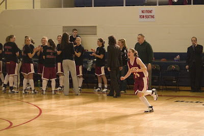
These are a few from a series of shots that I took in Rochester, NY at one of my friends' basketball games. The whole weekend of pictures was basically dedicated to attempting to work with the shutter speed and sports mode to catch the dynamic aspect that is inherent to sports. This can be captured by the freeze or the blurred motion...which I captured both of at one point or another. Each one has something that I liked, while there also always seems to be something that I want to change.
Could easily be cropped, but unfortunately I'll lose the ball, which is the focus of the players in the shot.
Could be cropped for better composition.
not happy with my positioning and that bar.

continued.
and more of the freeze and go motion.

Long exposure for pure motion...which also led to blurred lines from lack of tripod.

Stop-action.
Almost all of them are in freeze but the ball is blurred...darn. This image is pretty distracting on top of that, because of the colors, banners, lines, and multiple subjects...

This is one of my favorites on the day. It portrays exactly what is happening in the pick-play due to the motion shown in the shot. If I were to change it, I'd create a layer to "burn" (darken) the lit sign in the background because I feel like it takes away the focus from the play.

I caught the girl in the center of the action frozen in the frame, while the rest of the team is in motion around her. This was one of the best shots like this because the bench and the coach are also in freeze, to add to the overall difference between the action and still.

Here I caught one player's body in freeze and the other in motion attempting to drive past half-court. I was originally happier with this shot than I am now. I think it is the overall composition, which will probably be helped with some cropping--too much noise in the background.

Unfortunately I have this bar in the foreground of many of the images, which I may eventually crop for a better composition. I really like how the image is almost completely out of focus with the exception of the one girl at the center left of the image who just stole the ball. The only thing I wish could change is the blur of the ball. If both the player and the ball were caught in still--I think it would add a lot to the focal point.

I was working a ton with the shutter speed, and the sports mode trying to capture the motion like we were trying to in previous classes. I think this one is pretty successful at the stop-action, with only a little bit of blurring in the furthest players.

So I wasn't thinking much of this shot, until I took a second look. I guess because of the depth of field, the team in the foreground is mostly crisp while the team in the background is blurred even though they are right next to each other.

 Talk about looking superimposed! By playing with the levels in photoshop I was able to make some of the colors really pop. While I wasn't initially happy wiht the yellowy color of the walls, as it is not the natural state, it works because the photo is meant to portray the chaos of this space and plain white may have given it a "cleaner" look.
 So--I definitely like the 2nd shot better...because you can read dave even though he is out of focus, but I'm kind of unhappy with the color quality...it read much better in RAW than it does after being changed to JPEG.


 A slightly off-angled shot of the tower and side-entry roof

 At the suggestion of some of my classmates, I attempted a zoomed-in view. Unfortunately I was too cold to have control over my fingers enough to change to my zoom lens to make it really worthwhile.

 I think this one turned out alright. Is the contrast between the color and b/w too intense?


 So I wasn't thinking much of this shot, until I took a second look. I guess because of the depth of field, the team in the foreground is mostly crisp while the team in the background is blurred even though they are right next to each other.


